Five Data Apps Every SaaS Team Should Have
Essential internal tools that reduce churn, surface insights, and help SaaS teams make better decisions—faster.
Five Data Apps Every SaaS Team Should Have
Key Takeaways:
Most SaaS teams operate with critical blind spots: churn signals buried in spreadsheets, experiment results scattered across tools, billing errors caught too late.
Five data apps—customer health, experiment insights, revenue monitoring, activation exploration, and support triage—address the highest-leverage operational gaps.
Each app combines specific data sources, encoded logic, and an appropriate surface (dashboard, workflow tool, or alert pipeline).
These are starting points, not rigid templates. The real value comes from adapting them to your team's definitions of "health," "activation," and "risk."
Running a SaaS company means swimming in data. Product analytics, billing systems, CRM records, support tickets, feature flags—every team generates signals, but few organizations turn those signals into something actionable. The result is familiar: churn reviews based on gut feel, experiment debates without clear data, billing errors discovered by frustrated customers.
The fix isn't adopting more off-the-shelf dashboards. It's building the right data apps that are specific to your business—purpose-built tools that combine your data, encode your business logic, and surface insights where decisions actually happen. We've seen teams across industries build these apps in days instead of months, and the pattern is remarkably consistent: five archetypes cover most of what a healthy SaaS operation needs.
Here's what those five apps look like, why they matter, and how to think about building them.

1. Customer Health and Churn-Risk App
Every SaaS team talks about reducing churn, but surprisingly few have a systematic way to see which accounts are at risk before they cancel. The customer health app fixes this.
What data sources it uses:
This app typically pulls from product analytics (Mixpanel, Amplitude, Segment, or your own event stream), CRM data (Salesforce, HubSpot), billing history (Stripe, Chargebee), and support interactions (Zendesk, Intercom). The richness comes from combining signals that usually live in silos: login frequency from your product, deal size from your CRM, payment failures from billing, and ticket volume from support.
What logic it encodes:
At its core, this app calculates a health score for each account. The simplest version weights a handful of factors: product engagement (DAUs/MAUs, feature adoption, session depth), billing status (late payments, downgrades, failed charges), support sentiment (ticket frequency, CSAT scores, escalations), and contract signals (time until renewal, expansion conversations).
More sophisticated versions incorporate predictive models—logistic regression or gradient boosting trained on historical churn data. But even a rule-based score (red/yellow/green based on thresholds you define) delivers enormous value. The key is encoding your team's understanding of what "healthy" means. A product-led growth company might weight daily active usage heavily; an enterprise sales motion might care more about executive sponsor engagement.
What surface makes sense:
For most teams, a dashboard is the right starting point: a sortable list of accounts with health scores, trend indicators, and drill-down capability. Customer success managers can filter by segment, sort by risk, and prioritize their week. But the real power comes from pairing the dashboard with an alert pipeline—Slack notifications when a previously-healthy account drops into the red zone, or automated emails to CSMs when renewal is approaching and health is declining.
Why it matters:
Without this app, churn review meetings become exercises in storytelling. With it, teams can systematically identify at-risk accounts weeks or months before they leave, route attention where it matters most, and actually measure whether interventions work.
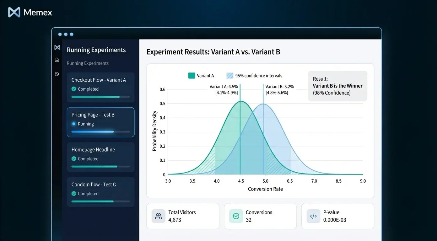
2. Self-Serve Experiment and Feature Flag Insights App
Most SaaS teams run experiments—A/B tests, feature rollouts, pricing changes—but the results often live in whatever analytics tool happened to be handy, interpreted by whoever happened to run the test. The experiment insights app brings structure and self-service to this chaos.
What data sources it uses:
This app connects to your feature flagging system (LaunchDarkly, Split, Statsig, or homegrown), your product analytics (event streams, user properties), and often your data warehouse where experiment assignments and outcomes land. It may also pull from revenue data to calculate business impact, not just statistical significance.
What logic it encodes:
The core logic is statistical: calculating conversion rates, confidence intervals, and significance for each variant. But the real value comes from encoding your team's decision criteria. What's the minimum detectable effect you care about? What's your significance threshold? How do you handle multiple comparisons? How do you define the primary metric for each experiment type?
Beyond statistics, the app should encode business context: estimated revenue impact, sample size requirements, and guardrail metrics that flag when an experiment is hurting something important (like increasing conversions but tanking retention).
What surface makes sense:
A dashboard works well here—one that lets anyone on the team see what experiments are running, which have reached significance, and what the results mean. The best versions include a "decision log" where teams record what they learned and what action they took. For teams running many experiments, an alert layer that notifies relevant stakeholders when an experiment concludes (or when a guardrail metric is breached) keeps decisions from stalling.

Why it matters:
Without this app, experiment culture atrophies. Results are hard to find, interpretation is inconsistent, and the same debates recur. With it, teams build institutional knowledge, make faster decisions, and actually learn from their experiments instead of just running them.
3. Revenue and Billing Quality Monitor
Billing errors are silent killers in SaaS. A misconfigured plan, a failed webhook, a currency conversion bug—these issues often go unnoticed until a customer complains or an auditor asks questions. The revenue monitor makes billing health visible.
What data sources it uses:
This app pulls from your billing system (Stripe, Chargebee, Recurly), your CRM (for contract terms and expected values), and often your data warehouse or accounting system. It may also connect to payment processors to track failure rates and retry outcomes.
What logic it encodes:
The core logic compares what should be happening with what is happening. Expected MRR versus actual collections. Contract renewal dates versus billing cycle alignment. Subscription quantities versus usage records. The app flags discrepancies: accounts being undercharged, invoices failing repeatedly, trials not converting to paid, or charges that don't match contract terms.
More advanced versions calculate dunning effectiveness (how well your retry logic recovers failed payments), revenue leakage (gaps between booked and collected revenue), and forecast accuracy (comparing projected revenue to actual).
What surface makes sense:
This app often works best as a workflow tool plus alert pipeline. A dashboard shows overall revenue health, collection rates, and trends. But the actionable layer is a queue of "billing exceptions" that finance or ops teams can work through: accounts flagged for review, with context about what's wrong and suggested resolution. Alerts escalate urgent issues—large failed payments, systematic plan misconfigurations—to the right people immediately.
Why it matters:
Revenue leakage is embarrassingly common. According to MGI Research, SaaS companies lose between 1% and 5% of revenue to billing errors and leakage. A revenue monitor doesn't just catch errors—it builds confidence that your numbers are real.
4. Onboarding Funnel and Activation Explorer
Activation is the most leveraged metric in SaaS growth, but it's also one of the hardest to instrument and analyze. The activation explorer gives product and growth teams a real-time view of how new users move through onboarding—and where they get stuck.
What data sources it uses:
This app connects to your product analytics (Mixpanel, Amplitude, Heap, or raw event streams), your user database (for account and cohort metadata), and sometimes your CRM or marketing automation system (for acquisition source data). The richer your event taxonomy, the more powerful this app becomes.
What logic it encodes:
The core logic defines your funnel: the sequence of steps from signup to "activated" (however your team defines that). For a collaboration tool, activation might be "invited a teammate and sent a message." For an analytics product, it might be "connected a data source and viewed a report." The app calculates conversion rates between each step, broken down by cohort, acquisition source, plan type, or any dimension you care about.
Beyond conversion rates, the app should highlight where users drop off and who drops off. Are users from paid campaigns activating at the same rate as organic? Is drop-off concentrated at a specific step, or distributed? Segment-level analysis turns a vanity funnel into an actionable diagnostic.
What surface makes sense:
A dashboard is the natural starting point—a visual funnel with drill-down capability. But the most effective versions include a user-level explorer: the ability to pull up individual users who dropped off at a specific step and see their full event history. This grounds analysis in real behavior, not just aggregate statistics. For some teams, an alert layer that notifies product managers when activation rates for a key cohort drop below threshold helps catch problems early.

Why it matters:
Small improvements in activation compound dramatically. If you can move your 7-day activation rate from 20% to 25%, the downstream impact on retention and revenue is enormous. But you can't improve what you can't see—and most teams are flying blind.
5. Support Quality and Backlog Triage App
Support tickets are a goldmine of product and customer insight, but they're usually buried in a ticketing system optimized for workflow, not analysis. The support triage app surfaces patterns, prioritizes queues, and connects ticket data to the rest of your business.
What data sources it uses:
This app pulls from your support system (Zendesk, Intercom, Freshdesk), often enriched with CRM data (account tier, contract value, health score) and product data (user segment, feature usage). Some teams also connect to their engineering ticketing system (Jira, Linear) to track which support issues become product bugs or feature requests.
What logic it encodes:
The core logic prioritizes the backlog. Simple versions weight by account value, SLA status, and ticket age. More sophisticated versions incorporate sentiment analysis (flagging angry or frustrated language), topic classification (auto-tagging tickets by issue type), and escalation prediction (identifying tickets likely to escalate based on historical patterns).
Beyond triage, the app should surface trends: which features generate the most tickets, which customer segments have the highest support burden, and how resolution time varies by issue type or agent. This connects support to product and success, not just operations.
What surface makes sense:
A workflow tool is often the right answer—a prioritized queue that agents work through, enriched with context from CRM and product data. A dashboard layer shows aggregate trends for managers: ticket volume, resolution time, CSAT by category. Alerts notify the team when volume spikes (indicating a possible incident) or when high-value accounts have open escalations.

Why it matters:
Support is often the last team to get tooling investment, but it's where customers experience your company most directly. A triage app reduces response time, catches patterns before they become crises, and gives support leaders the data they need to advocate for product changes.
Building These Apps Faster
Each of these apps follows a common pattern: pull data from multiple sources, encode business logic (metrics, thresholds, rules, or models), and expose the result through an appropriate surface (dashboard, workflow tool, pipeline with alerts).
Historically, building even one of these apps meant stitching together data pipelines, backend services, and frontend code—weeks or months of engineering time. This is where an AI software engineer like Memex changes the equation.
With Memex, teams can describe what they want in natural language: "Build me a customer health dashboard that pulls from Segment, Salesforce, and Stripe, calculates a weighted health score, and lets CSMs filter by segment and risk level." Memex connects to your data sources, generates the backend logic, builds the UI, debugs errors, and deploys the result to serverless compute—all from a single chat interface.
For SaaS teams, this means building the five apps above in days instead of quarters. Connect your product analytics, billing API, CRM, and support system. Describe the metrics and thresholds that matter for your business. Iterate in conversation until the app does what you need. Then deploy it so your team can use it daily.
Adaptation Is the Point
We've described five archetypes, but no two SaaS companies define "health," "activation," or "risk" the same way. A PLG company's activation metric is different from an enterprise sales company's. A vertical SaaS billing model looks nothing like a usage-based pricing model.
The value of these apps isn't in copying someone else's definitions—it's in encoding your team's understanding of what matters. Making building data apps 10x easier means that building ad-hoc apps is finally an ROI positive investment. The patterns we've outlined are starting points. The logic, thresholds, and surfaces should evolve as your business does.
If you're interested in building data apps like these, we'd encourage you to explore what's possible. You can get started with Memex for free or join our community on Discord to see what other teams are building.
FAQs
What is a customer health score, and how do SaaS teams calculate it?
A customer health score is a composite metric that predicts how likely an account is to renew, expand, or churn. SaaS teams typically calculate it by weighting factors like product engagement (login frequency, feature adoption), billing status (payment history, plan changes), support interactions (ticket volume, sentiment), and contract signals (time to renewal, executive engagement). The specific weights and thresholds vary by company.
How do I track experiment results across my SaaS product?
To track experiment results, connect your feature flagging system (LaunchDarkly, Split, Statsig) to your product analytics or data warehouse. Build or use an experiment insights app that calculates conversion rates, confidence intervals, and significance for each variant—and logs decisions so your team builds institutional knowledge over time.
What causes revenue leakage in SaaS companies?
Revenue leakage in SaaS typically comes from billing misconfigurations (wrong plan assignments, failed webhooks), payment failures that aren't retried effectively, discrepancies between contract terms and actual invoices, and currency conversion errors. A revenue monitoring app compares expected versus actual collections to catch these issues early.
How do I measure user activation for my SaaS product?
User activation is measured by defining a sequence of steps from signup to a meaningful outcome (your "activation event"), then calculating conversion rates between each step. The best activation metrics are specific to your product—e.g., "connected a data source" for an analytics tool or "sent a message to a teammate" for a collaboration app—and broken down by cohort and acquisition source.
What tools can I use to build internal data apps for my SaaS team?
Teams can build internal data apps using BI tools (Metabase, Looker), low-code platforms (Retool, Appsmith), or custom code. AI software engineers like Memex can accelerate the process by connecting to your data sources, generating backend and UI code, and deploying apps—allowing teams to build custom data apps in days instead of months.