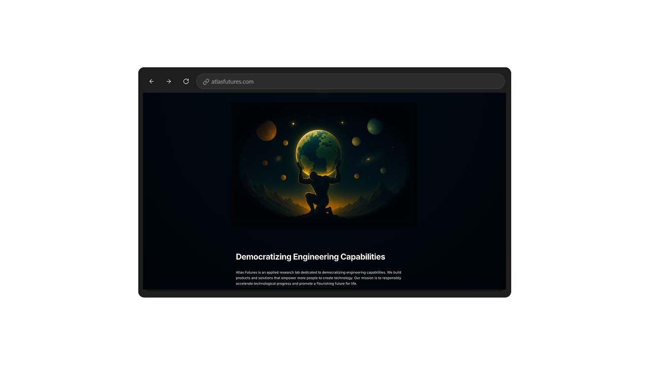
Create a landing page
A polished Next.js & shadcn starter for modern landing pages, featuring flexible components, fast builds, and customization. All open source

Next.js Shadcn Landing Page Template
Overview
This is a modern Next.js starter template built with TypeScript and styled using Tailwind CSS. Inspired by the Shadcn UI pattern and powered by Radix UI primitives, this project comes with a comprehensive library of reusable UI components that accelerate building production-ready user interfaces.
Features
- Next.js & React: Optimized for server-side rendering and static site generation.
- Rich Component Library: Includes components such as Accordion, Alert Dialog, Avatar, Badge, Breadcrumb, Button, Calendar, Card, Carousel, Chart, Checkbox, Collapsible, Command, Context Menu, Dialog, Drawer, Dropdown Menu, Form, Hover Card, Input (and OTP), Label, Menubar, and more.
- Tailwind CSS Styling: Fully customizable theming with light/dark modes configured in
globals.css. - Modern Layout: A clean and responsive global layout defined in
layout.tsxwith integrated Google Fonts (Inter) and essential meta tags. - Developer Experience: Organized file structure and scalable components for rapid development.
File Structure
app/
page.tsx
The entry point of the application. It displays a centered message ("Start prompting.") and serves as a placeholder for your home page content.layout.tsx
Defines the root layout of your app. It imports global styles, applies typography using the Inter font, and sets essential metadata.globals.css
Contains Tailwind CSS directives along with custom CSS variables and base styles. It defines a comprehensive theming system for light and dark modes.
components/
This directory holds a rich collection of UI components—from basic inputs and buttons to more complex elements like carousels, charts, and menus—each built to work seamlessly with Tailwind CSS and styled following modern design principles.
Getting Started
Install Dependencies
Install the project dependencies using npm:
npm installRun the Development Server
Start the development environment with:
npm run devBuild for Production
When you're ready for deployment, build the project:
npm run build
Customization
Theming & Styles
Adjust global colors, spacing, and typography inglobals.css. The file defines CSS variables for both light and dark modes.UI Components
Leverage the components in the/componentsdirectory to quickly assemble your application. Each component is designed to be flexible and easily customizable.
Contributing
Contributions are welcome! If you have ideas for new components, improvements, or bug fixes, please open an issue or submit a pull request.
License
This project is licensed under the MIT License.